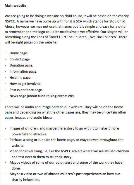
Tuesday 10 May 2011

evaluation

Website Evaluation


For my media project, I have created a website for a child abuse charity; whilst making my website, I have developed and challenged forms and conventions of real websites to make mine as close to a real website as possible.

Before I started to create my website, I researched others to see the conventions they used throughout their websites so that I could later develop this onto my own website. In each website I looked at, I found many similarities; each website consistently had their logo shown on every page and they each had a navigation bar and links around the pages. They also had at least one image on every page to create visual aid for the audience. Although each website had slightly different layouts, they were all similar in the sense that they each had the logo at the top of the page, a navigation bar and links and text in columns underneath the navigation bar. From this research I started to create my own website. To start, I created a logo for the site, I followed the idea that each site I looked at had a logo that represented the charity in some way, therefore the logo I created is a smiley face as the charity I focused on was child abuse, and I felt that this would be a child friendly logo and in comparison to some other sites we looked at, I found that this logo would be more memorable. I then started to create the basic layout; a navigation bar underneath what would be imagery, text box’s in columns under the navigation bar, with a link box on the left hand side. I decided to create the link box, as I felt I challenged some of the conventions of other sites, because not every site had a link box to make it easier for the audience to navigate their way around. Throughout my website, I have used the colours that are in my logo to enhance the audience’s attention, there are three main colours; red, blue and yellow. Each of the colours are primary colours so that they contrast but not too much. It also makes the writing easier to see and the overall appearance of each page a lot more aesthetically pleasing for the audience. The images on each of the pages of my website do not follow the colour scheme of my website, however the contrasting colours makes the images seem more important, therefore they automatically catch the viewers attention to make them understand the importance of the charity even more so.

To challenge other websites I decided to add a slideshow and video to my website; the slideshow is repeated three times at the top of the website with each slide being shown at different times; I found that this was the most effective overall look as it portrays the emotions in each picture more forcefully. It not only gives off a strong message to any audience, it also creates more visual aid to the audience and draws them in because they may want to know what happened to the children, and therefore want to donate. The video gives the audience an understanding of fundraisers that can help the charity as well as make people want to donate; the video offers an easy understanding for a younger and perhaps older audience and makes any reading easier as well as the video has talking in it. Within the text I tried to make the information detailed and interesting to capture the audience throughout each page, particularly the ‘share your experience’ page as it shows strong emotion and therefore would entice the audience to want to donate. The fonts used for the text is a simple font for any age audience to read, Eurostile is very clear in any size, therefore this is why I chose it. Around the text box’s I added shadowing to create depth to that page to make the information box’s stand out so that the audience could clearly see the important parts on the pages; I also created the page to a typical size of a website that being 900x600 pixels so that the audience did not have to move their screen around constantly making it easier to access things. These things collectively show development and challenging of real websites.

Throughout my research of websites, I not only looked at challenging and developing a website, I also looked into how they represent particular social groups. In our research of websites we found that a few child abuse charity websites are aimed mainly at adults from 18 upwards as the language used is quite sophisticated and some of the parts of the websites are quite complex; they also all included donate pages, making them relate more to the older audience as a younger audience would not be able to use a bank card in order to donate. However, in the research I done first hand with surveys, I found that many age groups still felt strongly about the campaign and would donate or visit the site to see how they could help with. This made creating the website based around an age group slightly easier. I felt that it would be best to make any age group feel included in the website/charity; therefore I used simple language throughout and made links clear for anyone to use. I also gave as much detail as possible throughout every page and included a contact page for the audience to get in touch with the charity via different ways. I also made the ‘share you experience page’ so that any child could see that the charity is useful and does help, this also showing the older audience that the charity is worth donating to. I found that there was no need to make my website based more on one gender as both genders are included within the problem that the charity is there for. For my pictures I felt it necessary to show both different genders and also race as any child can be abused, I have also included images with different age ranges, so that the audience can see that the money they donate goes to all different children. The slideshow shows a group of teenagers collectively in a dance show, I chose to film this because I felt that it suggests that any age/gender/ethnicity can do something to help the charity and therefore make the charity more known. I specifically decided to create the ‘get involved’ page so that any age group, particularly the younger age groups could see how they could help raise money for the charity, as they cannot use the donate page unless they are over 18, so I wanted to create a balance throughout the website. I also really wanted to portray the problem at hand that our charity is campaigning for, so I created our ‘share your experience’ page, to really enhance the problem through the reality of real life stories, making the audience feel they have to solve the problem by donating to the website. By including each of these things I feel I have represented all age groups well and effectively so that the charity becomes more popular within different social groups as well.

Throughout my research I have also learnt that the person that makes a website is the publisher, nothing is done without the consent of the publisher of the website, therefore making me the publisher of my site; however as a publisher you must buy a domain and also make sure that Google can find your website so that your website can become well known and well used. You then have it distributed by the ISP (internet service provider) this is the process that I had to go through whilst creating my site. Before publishing my site I had to preview my site to make sure everything worked well and nothing was out of place, and all spelling was correct. This is one of the benefits of being a self publisher of a website; that being that it is easy to edit even once it has been distributed, and although you have to buy all products and programs, it would work out cheaper than a newspaper company for instance. They have many people for different sections which then get put together and distributed, this costs a lot of money, and nothing can be edited once the newspaper is out, whereas a website can. However, newspapers have an upper hand in the sense that once produced they are in shops in front of people to buy making their company well known, but, websites once linked to Google have to wait to be found, which could become a problem for a company and particularly a charity. Although websites have to wait, they can be advertised to make the site more popular, therefore making a distributed website a better option of media product for a charity. This making it better for the charity I have created, as if it was a real charity, it would be better produced as a website, as more people can view it and edits can be made whenever.

When looking at other child abuse websites, I found that most of them were aimed at adults, to attempt to get donations as adults would have more of an understanding of the problem at hand and therefore sympathize with the campaign as there is a very strong emotional message being sent out, making an adult audience feel things that young children wouldn’t understand. They do this via imagery, videos and text. Sometimes the colouring they use within the website creates perhaps a more saddened effect. However, there were a couple of websites that I looked at that were suitable for younger children and teenagers to find interesting, so I focused on the points that would really draw in their attention. I found that the bright colours and the use of a logo that is quite childish automatically makes the site more visually appealing for a younger audience and also makes it clear to them that the website has things for them as well. The pages that would appeal mostly to the younger audience would have things such as games, but the games would involve something to do with children in need to really try and get the message across to all age groups. This is what I mainly focused on when creating my site with audience in mind. I felt that it would be best to include all age groups audiences, as my site is about children and therefore the effects on parents or adults. Throughout the website that I created you can see the logo which is very child friendly and is something that children any age know and recognize, and understand that it means happiness or a similar emotion, therefore they would automatically remember and warm to the site, I then made sure I consistently used the colours that were in the logo around the site, to keep a reminder that the site is a friendly site for a young audience. I then added in a lot of visual aid to help the young audience perhaps understand what the site is about more if for instance the struggle to read or understand any of the language used. I added in a video to make them feel more involved and again to make it easier for them to understand the site. The most important thing however, is the confidentiality promise on the ‘helpline’ page. Making it clear to any child that is being abused that the things that they tell us would be in complete confidence. I have written this promise in a way that hopefully most children would understand, so that they feel they could reach out to us if needed. Not only do a lot of these conventions help invite a younger audience to the site, they also invite adults. For instance the imagery sends off a big impact to an adult, making them really want to reach out and help; the text and language is simple enough but effective enough to make an adult sympathize for the children even more so, and the video really shows them that the people truly do get involved and want to help out with our campaign. Therefore making my target audience everyone; no age limit or gender makes a difference to the website, it is created for any audience to make the charity have more of an effect on people.

During the course of creating my website, I learnt to use new software and hardware, and develop my skills on software I have used before. To create my website I used two pieces of hardware, those being the iMac as it has all of the software, and a video camera to upload onto software so that the video could be put onto the website. I found the iMacs to be a very good piece of hardware as they were easy to use to create my website; however they held me back in producing my website because you cannot access some of the same things that an iMac can on a normal pc computer, making it harder to progress quickly. The video camera on the other hand, I found useful as it was simple to use and upload onto the iMac. Mostly, I learnt more about how to use the software on the iMacs than anything else, I was introduced to completely new programs, but after learning to use all of them for my preliminary site, I found it much easier to do everything for my main website. I found iWeb very easy to use and it really helped in the sense that it was easy to get everything into place and aligned because of the graphical lines that marked everything. It had a wide range of fonts to chose from giving us a variety to chose from, and the colour palate was vast making it easier for me to create a colour scheme. Like iWeb, Photoshop was another program that I found very easy to use in creating my logo and also editing some of my images to make them more aesthetically pleasing; because I had used Photoshop before I felt confident in using it and just developed on skills that I already knew. On the other hand, garage band, a program I used to create music for our video I had some trouble with, as there were so many options of what music you wanted it took quite some time to eventually make the choice that I wanted. Similarly to this, I found that I struggled to use final cut express to create my video. Some of it was easy, for example, cutting the video to how long/short I wanted certain parts, but adding in the music on top and trying to get it to all fit together, took some time as it can become quite complex the more you add onto the program. Finally I used iPhoto to create the slideshow on the website; I found that it was a very quick and simple way of creating a slide show and the end result looked professional and effective. I would say that most of the hardware and software were pretty simple to use but made things look professional and effective, however there were certain programs that I struggled with at first, but soon got to grips with over the course.

Throughout the course of making both my preliminary and main website, I feel I have learnt a huge amount about creating a website that an audience would view and find interesting. When I first started on my preliminary website I wasn’t confident in using iWeb, iPhoto and final cut express. I now feel a lot surer about what I’m doing and what looks best. In my preliminary website I felt I found a few parts to it which I think would look much better if they were just edited slightly, for instance the rollovers once they have been visited stay the same colour as the rollover colour, I learnt from this and therefore did not do the same thing within my main website. I personally feel that colour choice has a great effect on keeping an audience interacted with a website and from my point of view, I fell that the main website looks much more interesting because the colours used are more vibrant and interesting and I felt that this would make the overall website look better. Although I thinks certain parts of my preliminary website could be improves, I also feel that it looks very professional overall and would look good as a school website. However, I also find that some improvements could be made to my main website to make it look more like a real website, for instance, adding in advertisements and perhaps filling some more of the space within some of the pages so they looked a bit less bare; but I think that the overall look of my main website is professional, tasteful and quite realistic. I am pleased with the outcome of both my websites, particularly my main website, as I feel I have put in as much effort as I could and found that the outcome reflects this, and the website looks better than I originally thought it would, because, at first the designs didn’t look too great but once the website was finished, I felt proud of what I had achieved.

Thursday 3 March 2011

3rd march

Today we published our site, to make sure that everything on the site was in working order, like links and slideshows, we found that there were no problems or difficulties with anything and we were very happy with the overall turn out of our website.

Wednesday 2 March 2011

2nd of march

In todays lesson we created the music to go with our video on our webiste. We used a program called garagband and slowly started to create a track using drum beats and a piano. We then added to it to our video to see if it fit in with the dancing, and we felt it fit in really well so we saved the video and then added it to our site.

Tuesday 1 March 2011

contact us page in progress

Our contacy page needs alot of work done to it to fill in blank spaces and make the oage look more interesting  and realistic.

share your experience page in progress

The share your experience  page just needs to have the slideshow at the top of the page, anything else would be too much to look at and take away the importance of the stories on the page.


news page in progress


This is our news page in progress this is almost done, it needs to have th slideshow at the top of the page and prehaps some imagery too.

helpline page in progress


Our helpline page is almost finished there are just some bare parts of the page that would look much better if they were filled in with text or imagery.


get involved page in progress


Our get involved page still has alot of work to be done to it, alot of text needs to be added, and our video will also be on this page once it is completely finished.

donate page in progress

This is our donate page in progress. Other than the slideshow not being on the top of the page, this is the final look for this page, we are quite happy with the outcome of our website so far.


about us page in progress

This is our about us page in progress, this page is also almost finished however some parts need to be added and some changed ot make it look the best it possibly can.


home page in progress

This is our homepage in progress, you can clearly see we have not used a template and some work still needs to be done, but it is slowly coming together.


Monday 28 February 2011

28th February

Today we created our video using final cut express. we used clips that we thought looked best, and would keep the audiences attention throughout. We added in cross dissolves so that one clip went smoothly into the next. We also muted the sound of it as we will be creating our own soundtrack to go on it.

Friday 25 February 2011

25th February

We took the vidoe camera out today to create our video to go onto our site. we went down the the dance departement and filmed a girl and boy talking about the competition and then we filmed the dance.

Thursday 24 February 2011

24th february

Today we photoshoped any images we wanted to use in our slideshow. again we mainly cropped and airbrushed some of the images so that they would have more of an impact on the audience. once this was done we added them into iPhoto so that we could create our slideshow. We changed the speed that each slide was shown at, and then saved it. Once we had done this, we added it to our website and had it copied 3 times, to give 3 times the impact to the audience and also so that they could see more than one picture at once.

Wednesday 23 February 2011

23rd february

We photoshoped the images we wanted on our website today. Mostly we cropped them to the size we wanted, and some we airbrushed slightly, but there wereno big changes. once this was completed, we added them onto the correct pages of the website.

Tuesday 22 February 2011

22nd February

Today we found icons for links to other sites such as facebook and google to create a more realisitic look to our website and also for links to other pages to do with our website. We then made all of our links active by using the inspector. we made the links have rollover but once the page was visited the text wouldnt change colour as neither Mia nor I found this looked as good.

Monday 21 February 2011

21st February

Today we carried on finishing of the basics of our site. Firstly we added in the time and date to make it look mor like a real site, and we then added in a search engine to the top of the page to make it easier for someone to find their way around. We then created the link box down the left hand side of the page, for another way for people to get around the site.

Friday 18 February 2011

18th February

Today we carried on where we left off. We started to write up the text that needed to go into the text box's and then finished creating our navigation bar so that people could find their way around the site.

Thursday 17 February 2011

In todays lesson we started to create our website. We created the initial layout of each page to create a base for us to start working on. We added colours onto the text box's and chose fonts and colours. We then added in where we wanted the logo to go and the titles for each page at the top next to the logo. This was an easy process as when you copy and paste on iWeb, it pastes everything to the exact position it was originally in.

Wednesday 16 February 2011

website layouts

In todays lesson, we started to design each page of our website. We tried to keep the same layout consistent on every page to make the webiste flow and to also make the website look more like the websites we researched, as they also kept a roughly same layout throughout.

Tuesday 15 February 2011

Making our logo

After drawing our logo in the previous lesson, we started to design in using photoshop. We used the shape tools to get each of the shapes in the logo; we had to create a new layer every time we created a new shape. Then we used the paint bucket tool to fill in the colours of each part of the face, for this we used bold primary colours, but softened them down slightly so that they weren't so harsh. Below is the finished logo:

Monday 14 February 2011

logo design for main website

In todays lesson we drew out our design for our logo for our main website. we made it a very simple and child friendly logo as our website is about child abuse and we wanted something that children would recognise as something good. We also used primary colours in the logo to keep it simple yet effective and child friendly.

Friday 11 February 2011

Today we created our shotlist for our images and video. We made this so that we could go back to it for reference if we needed to and also to make it clear exactly what sort of images we need. Below is the shotlist for our images and video:
 IMAGES:
- pictures of sad childen, so that they have an emotional impact on the audience.
- pictures of groups of people to represent the people that have done fundraising events for the charity.
- pictures of new families that with ex abused children who are now happy.
- pictures of a teenager on a phone to represent the contacting part of the website.
- both boys and girls in pictures to represent gender.
- a range of age groups of the children
VIDEO:
- clip of a girl and boy explaining to the audience the fundraising event they are doing in order to help the audience understand.
- different clips of dancing each featuring boys and girls, some parts with one boy and one girl, other parts with the group as a whole.

Thursday 10 February 2011

Design brief for main website

After doing the research on charity websites, we made our design brief for our main website. We created this brief to make it easy for us to make our website quickly and efficiently and to also show that we have thought and planned through the making behind our website. Below is our brief:

website research for main website.


In today lesson we paired up to create our main website. I paired up with Mia and we started researching what children's charity websites were like. Mostly we found that the layouts were a very simple design making it easy for the audience to use and in these cases the websites are also there for children, so it is important that these website are easy to navigate your way around. Each website we looked at had a consistent colour scheme and the colours were usually quite bright and vibrant colours but not too distracting, making it aesthetically pleasing for the audience. We also noticed that each of the websites but one had their logo's in the top left hand corner with nothing around them to distract the audience from them. they were also quite big and took up quite a lot of space at the top of the page. There is also visual aid on each of the homepages of the websites to make it more interesting for the audience that are viewing the website, especially for the younger audience. The links and navigation bars are all very easy to use and clearly places to make it very easy to use, they mostly have rollovers to show you exactly what your clicking on. If the audience found using these hard, there is also search bars on each of the websites. Each of these things we will take into consideration when creating our website.

Wednesday 9 February 2011

survey graphs for main website

Once we had put together a detailed summary of the answers to our survey, we made a graph for one of the answers to show a different way of looking at the outcome, and to see if it would make it any easier for us later when we start to make our own website.

survey details for main website.


After creating our survey and getting back all our results, we put together a detailed summary of the answers for each question. We found it easier to read answers and find out which answers were most popular with the questionees. It will also make it easier for us to see whether we can make anything better for the audience on our website after we have made it.

Survey for main website

In today's lesson Mia and I created our survey for our main website to find out the demographics (details about people i.e age) and psychographics (details of what people like) so that we could create our website based around this. Below is our survey: POST SURVEY

Tuesday 8 February 2011

8th February

Today I created all the links on my website and made them active. I done this by highlighting the text/box that i wanted to be a link, then clicking on the inspector and choosing the hyperlink button and then making my hyperlink active to either my home or media page, depending on where the link is taking you.
I also added in any additional photos that needed to be put on the website to finalise my preliminary website. I then published my entire site to check that everything was working okay which it was.

Monday 7 February 2011

7th February

Today I created the slideshow and added it to my website on my homepage. I did this by adding each of the images I wanted onto the program iPhoto and then changing how long i wanted each slide to be shown for. I then saved this and added it to my website. 

Friday 4 February 2011

4th February

In today's lesson I carried on creating my preliminary website. I added in my previously made logo, and also the text into each of the text box's; I changed the colour, size and font of the text to make it astheticly pleasing to the audience, i also aligned the text to the center of the box. I then added the date and time above the navigation bar. I did this by going to insert - date and time - and chose the style of date and time I wanted. i then changed the font, colour and size, and distributed and aligned them evenly.

Thursday 3 February 2011

3rd February

In today's lesson I decided to edit some of the images I took in previous lessons. I used photoshop to do this, using the information I learnt at the start of the course. I found that most of the images just needed cropping and the hue/saturation levels needed changing to make the picture look brighter/darker. I also blurred parts of the image to give it a bit more of an airbrushed look. Here are some of the images I have edited:


Monday 31 January 2011

31st January

In todays lesson I created a shotlist for my preliminary website:


I then went out and took pictures around the school in places I thought would show the school at its best. during my research I found that the audience prefers images and visual aid on a website as it engages them more and they find it more interesting, therefore I also thought it would be a good idea to create a slideshow for my website using the iPhoto program as it is a simple yet effective program to use.

Friday 28 January 2011

28th January

In today's lesson, I started to create my school logo for my preliminary website. to do this I used the program photoshop. I firstly created the shape of the logo by clicking the shape tool, which then created the shape that I was looking for to the exact size I wanted. I then created the text using the text tool, and changed it to the size I thought was best, and made the colour black so it would stand out. I then made the inside of the logo green so that it would follow the colour scheme of the website as the research i have done has shown each website to do this. Below is the logo:

Wednesday 26 January 2011

26th January

In today's lesson I started to create the basic layout for my preliminary website. Firstly I created the school name of the website by creating a text box and then changing the font and colour to exactly how I wanted it. I then started to create my navigation bar by creating 5 text box's with 5 different titles for each pages that would in theory link to their correct page if the pages were made; then, I joined them together, distributed them evenly, and aligned them from the top. to that they were straight. Next, I changed the colour of the background of the text box's to green and changed the colour of the text to black; I also put a shadow around the whole navigation bar to create depth. After, I started to create each of the text box's that would go onto the home page and placed them exactly where they needed to go, aligning them correctly to start to show the layout clearly. I then filled the background of the text box's to the same green as the navigation bar and added shadows to create depth. I then copied and pasted all of this onto another page which would be my media page.

Tuesday 25 January 2011

25th January

In todays lesson we started to learn how to use iWeb on the mac computers. This is the program that I will be using to create my preliminary website. We started to experiment with different tools on this program, mainly the inspector tool, as it will be the main tool we will be using. This lesson gave me a brief idea of what we'd be doing in the weeks ahead

Friday 21 January 2011

Design for school website. Home page and media page.


In todays lesson I drew a design of what I would like my preliminary website to look like. I have gone for a very simple and often used layout, with a typical school logo as it seems most people repoded well to this in the surveys. Both the 'home' and 'media' page will have the logo and image at the top; the navigation bar underneath and a subject link box on the left hand side of the page. There will be many different media links throughout the 'homepage' to make it easy to use for the audience, and the 'media page' will have a clear link back to the 'hompage' on the navigation bar. Although both sketches have come out black and white on the computer, there is a colour scheme throughout of dark green boxes with black writing and a white background. I have tried to keep the typical conventions of a website that I found in my research.

Thursday 20 January 2011

design brief


This is my design brief for my preliminary website. By writing a brief it made it clear for me to get every detail as i wanted it and also made it easier for me to get everything done in order. I tried to make this brief as detailed as possible so it was simple to stick to and also show an audience that the website had been thought into.

Wednesday 19 January 2011

survey

In todays lesson we looked at different questioners and surveys to make it easier for us to make our own survey, in order to create our preliminary website in a way that people would like. Throughout the survey I thought about the use of demographics (details about the person i.e. gender) and psychographics (details of what a person likes) Below is my survey:

survey details and graphs


This is a detailed summary of the results for each of the answers to my survey. I decided to do this so that I could see what the best results were and therefore incorperate them into my preliminary website. Below I have made a couple of graphs from the results I have collected, to make it easier to see what the audience would prefer to see on a website, and how different aspects of a website can make people like/disklike it.